Rare Bird Distillery
Rare Bird makes excellent gin. Their inspiration comes from the passion for winemaking they’ve experienced in Bordeaux and Tuscany – and good old Yorkshire ingredients.
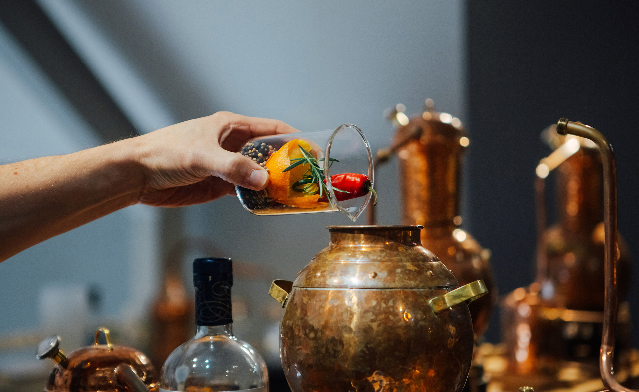
Their Malton distillery also houses a gin school, where aspiring gin-makers can learn the ropes from Master Distiller Matt.
We were approached by Elizabeth and Matt to develop a sophisticated brand for Rare Bird. They needed a look and feel that would reflect the business’s fiercely independent nature and pride in its Yorkshire heritage.
The brand solution also needed to be scalable enough to grow and adapt with their product range.
Read moreOur Approach
A visit to the wonderful Talbot Yard in Malton told us a lot about Elizabeth and Matt’s vision.
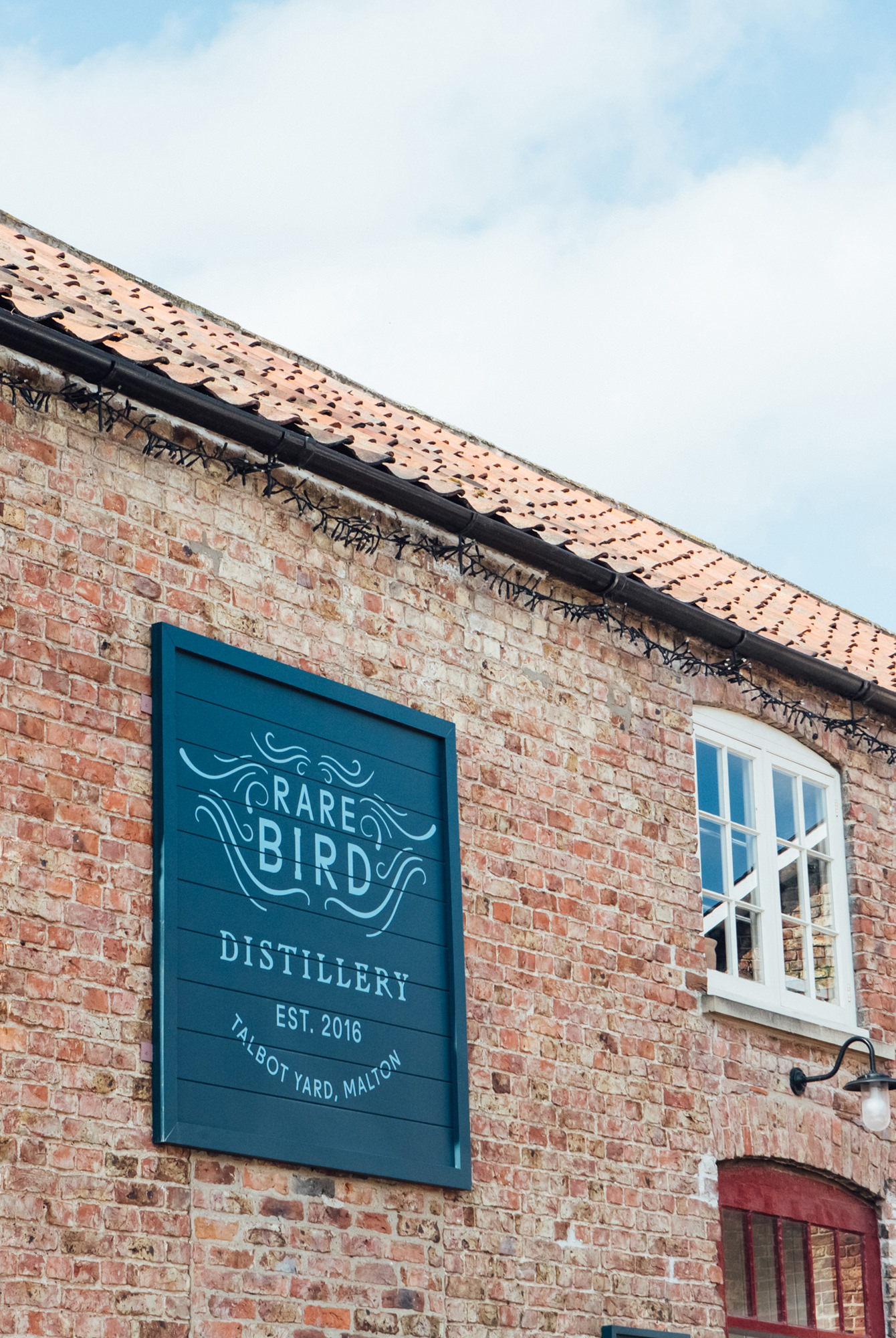
Rare Bird is housed in a converted stable block with lovely old wood floors, exposed brickwork and their beloved copper still named ‘Florence’. Everything there says luxury, good taste and simplicity.
With this in mind, we began to look at design elements, illustration styles and typography that would support these values.
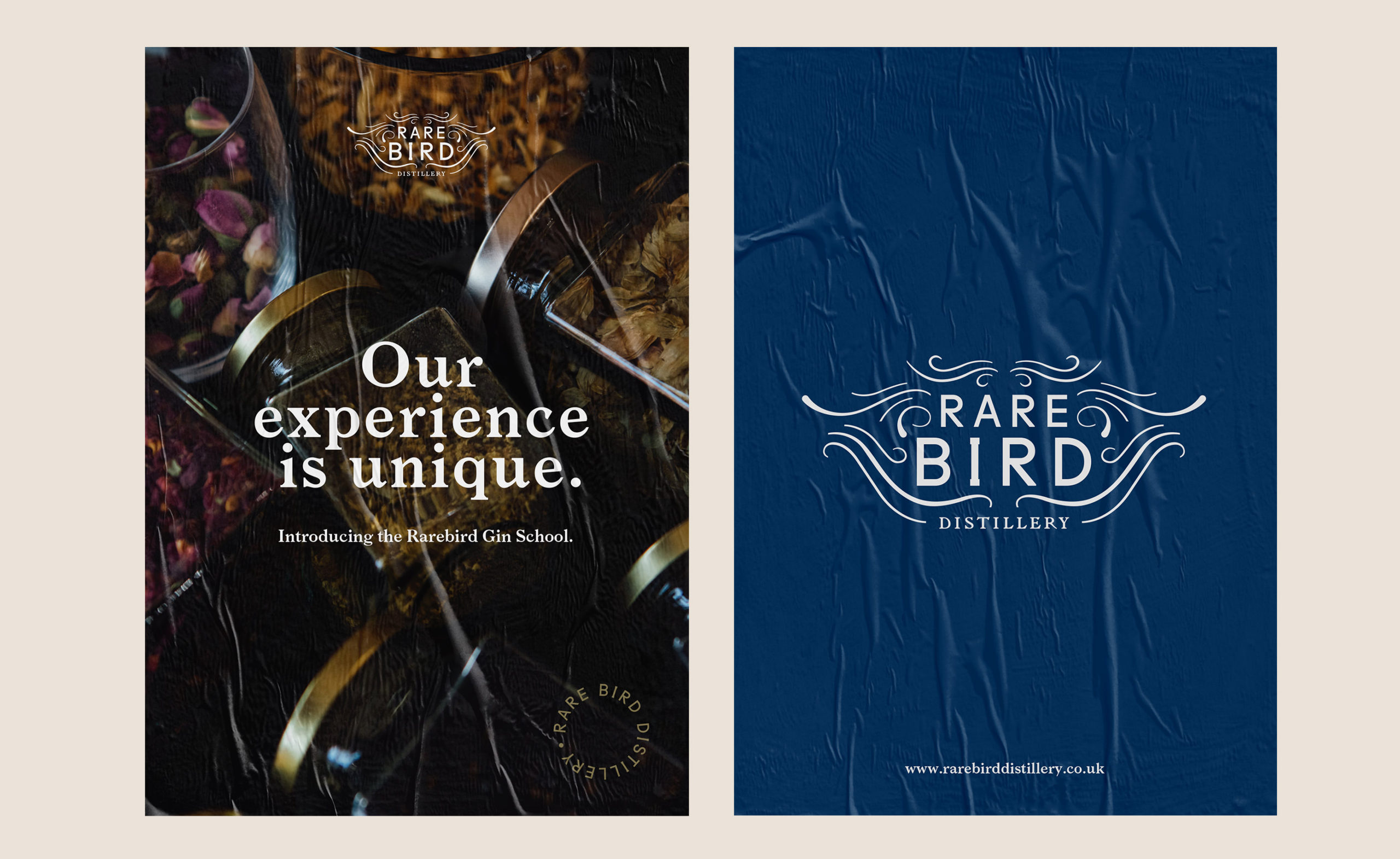
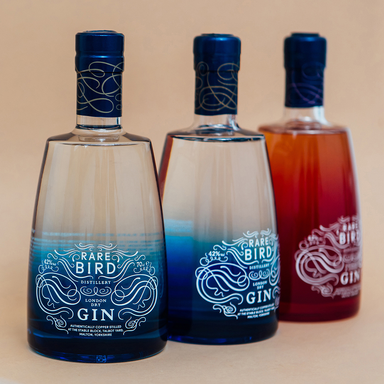
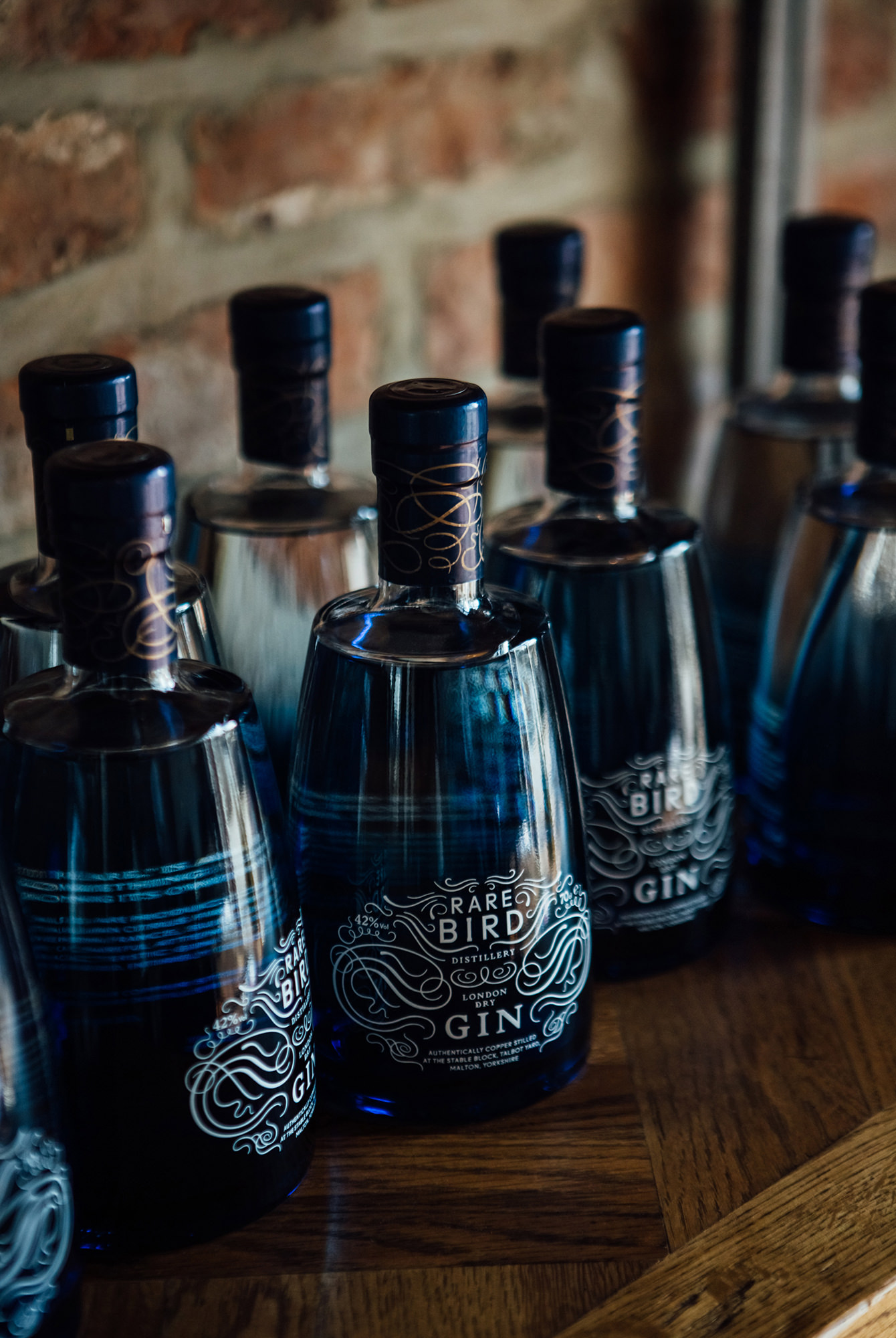
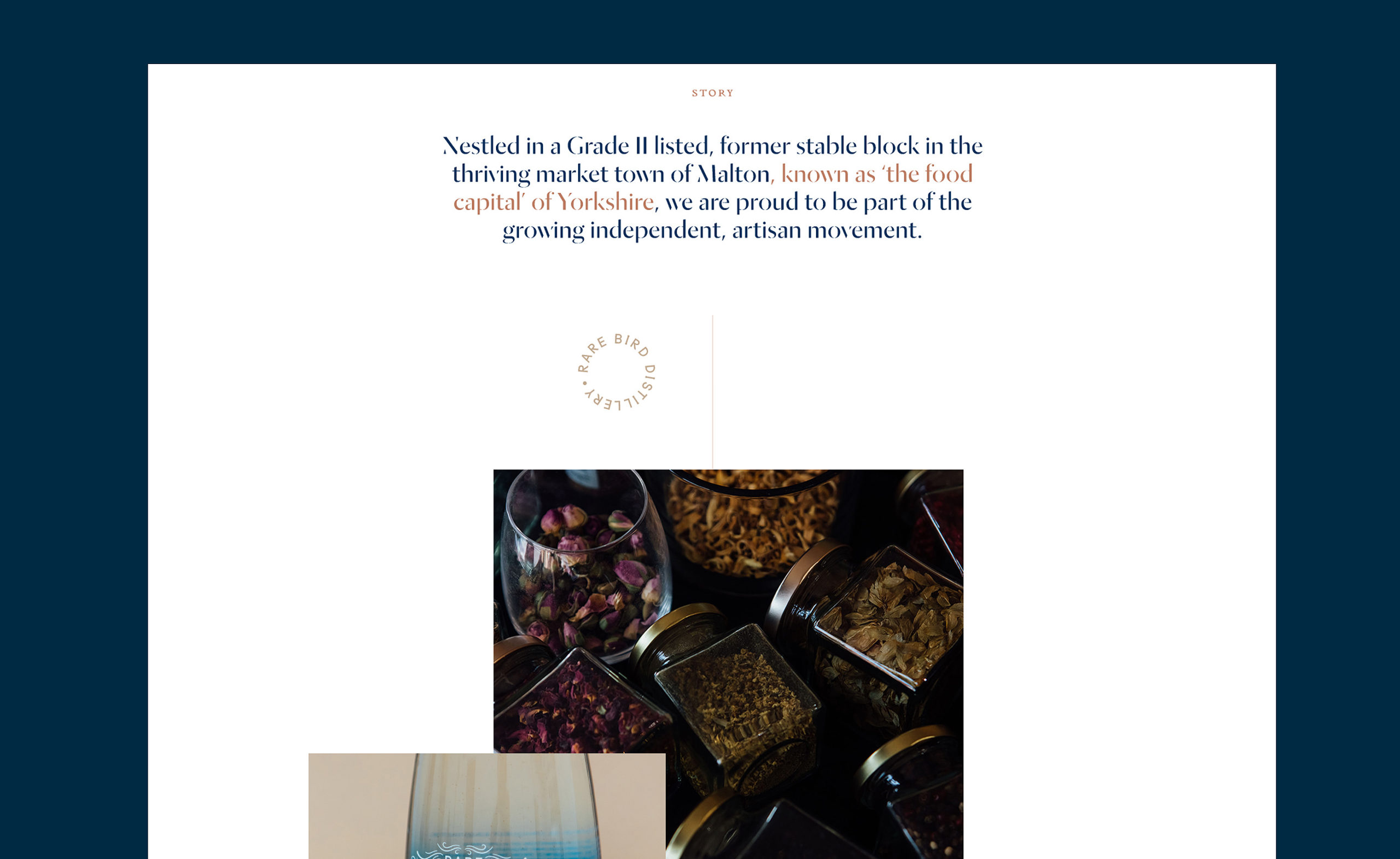
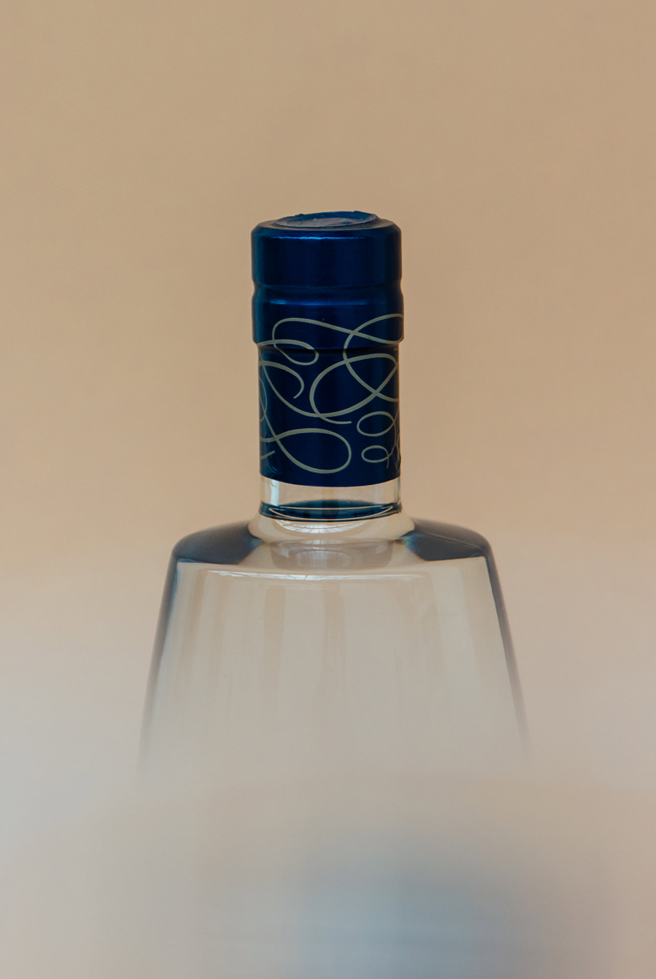
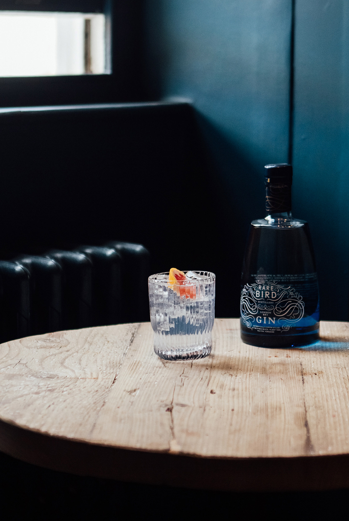
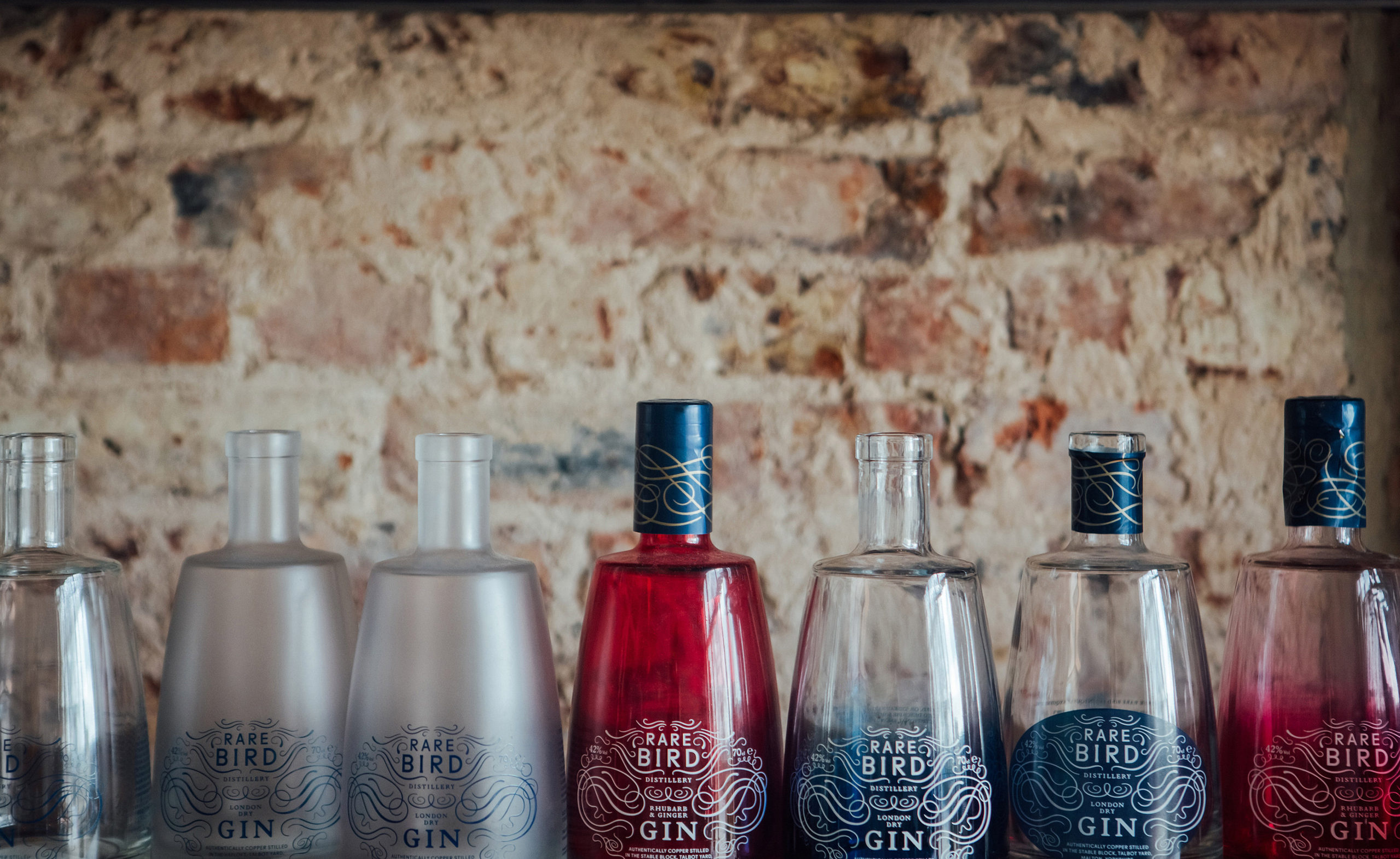
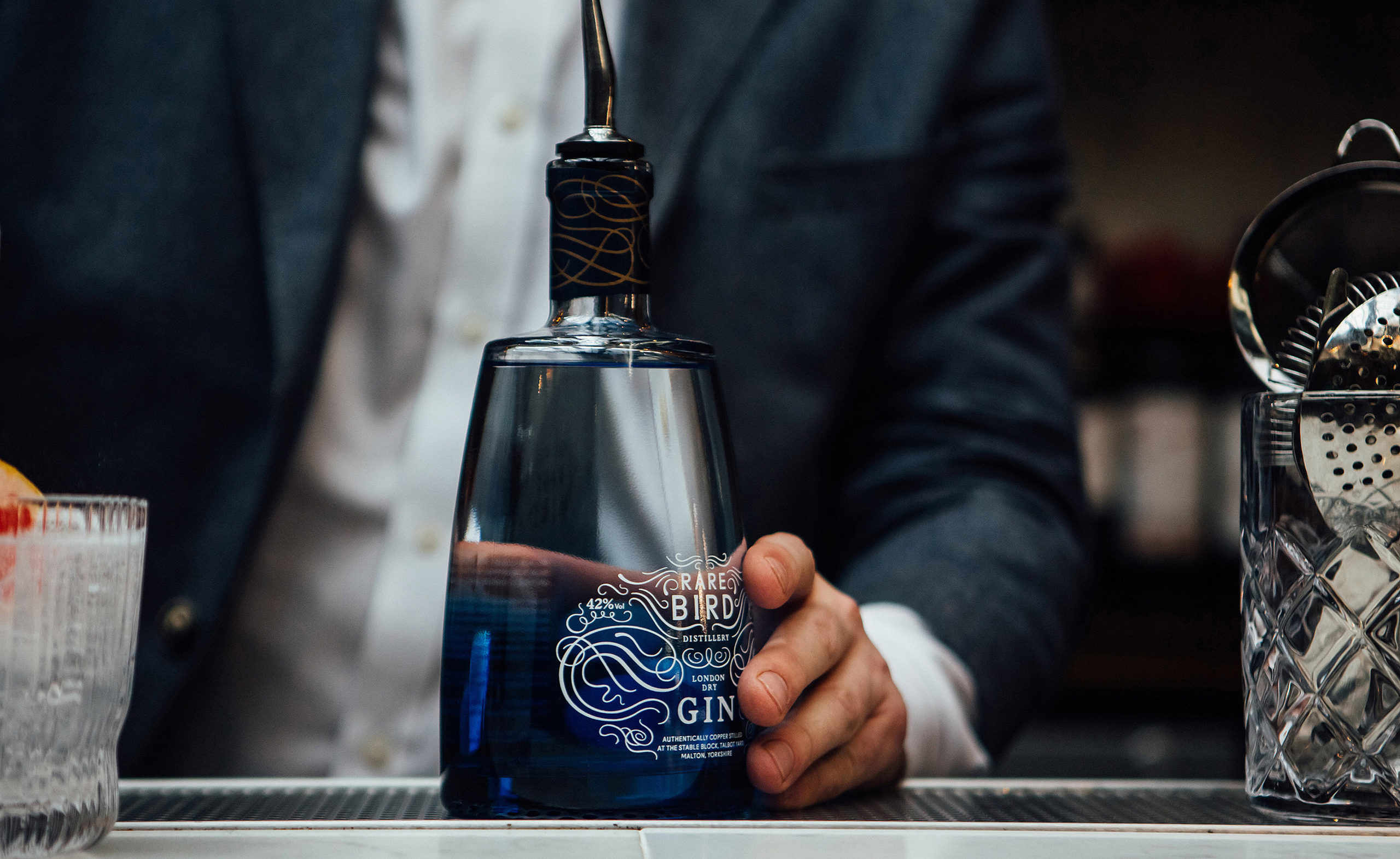
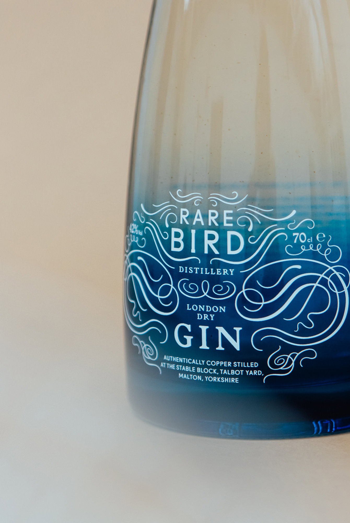
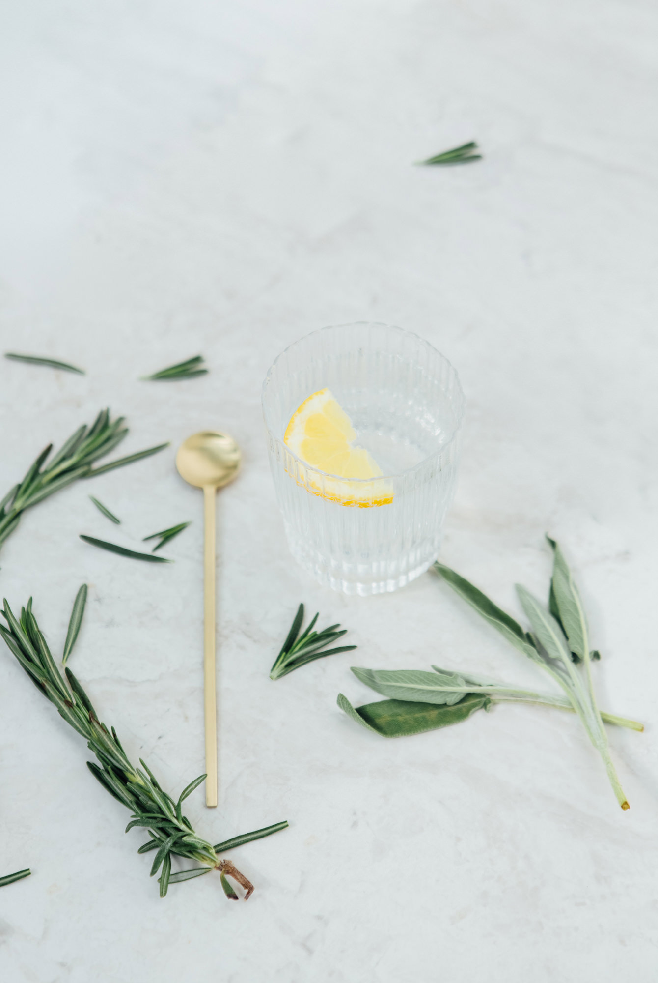
We came up with an ornate, curved linear design for the brand mark and bottle. Its shapes hint at the 11 botanicals that go into the gin – hibiscus, citrus peel, French rosemary etc – while its decorative nature says elegance and luxury.
We then added a suite of hand-drawn illustrations of the product and its ingredients, for use across digital and print. Finally, we created a simple, elegant font with an art deco twist.
Once all the assets were in place, we were able to roll out the new brand across signage, product, digital and press.
The Results
– 25k of new business achieved in first 6 months
– Major national new customer acquisition including Virgin Trains
– Increased brand confidence and trust
Services
Brand Identity, Packaging Design, Collateral
Sector
Food & Drink, FMCG
“United by Design took on-board our ideas, joined in our passion and enthused about our identity”
Matt Stewart, Rare Bird Distillery
